Some smaller works in the making
Currently working on some smaller works for a change.
This one is called “Column”, acrylic on canvas, 50 x 40cm, 2026.
Currently working on some smaller works for a change.
This one is called “Column”, acrylic on canvas, 50 x 40cm, 2026.

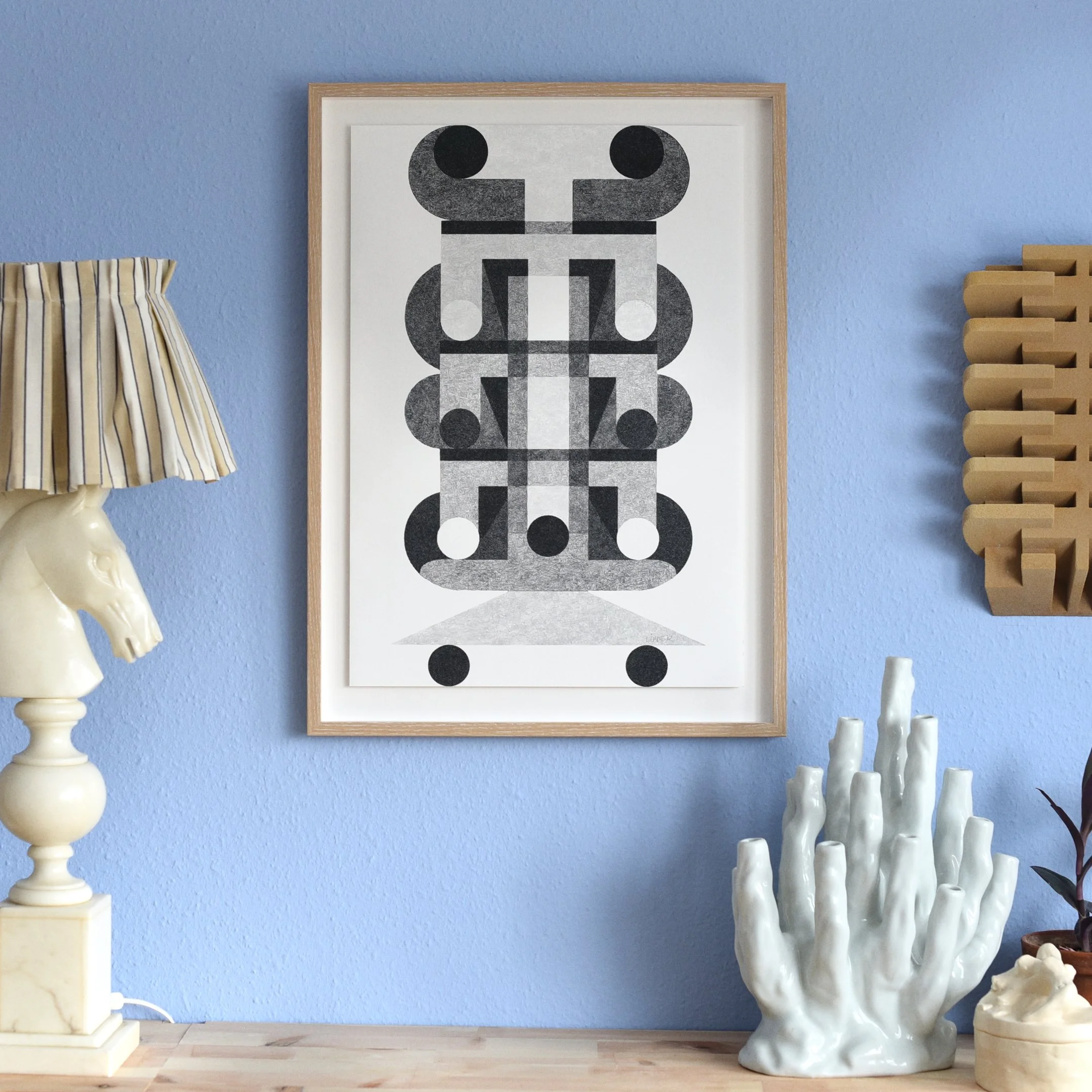
Visited one of my collectors to snap a photo of a painting he purchased a while back. Was happy to see that the painting adorned a super lovely reading corner complete with a beautiful Eames chair! 10/10.
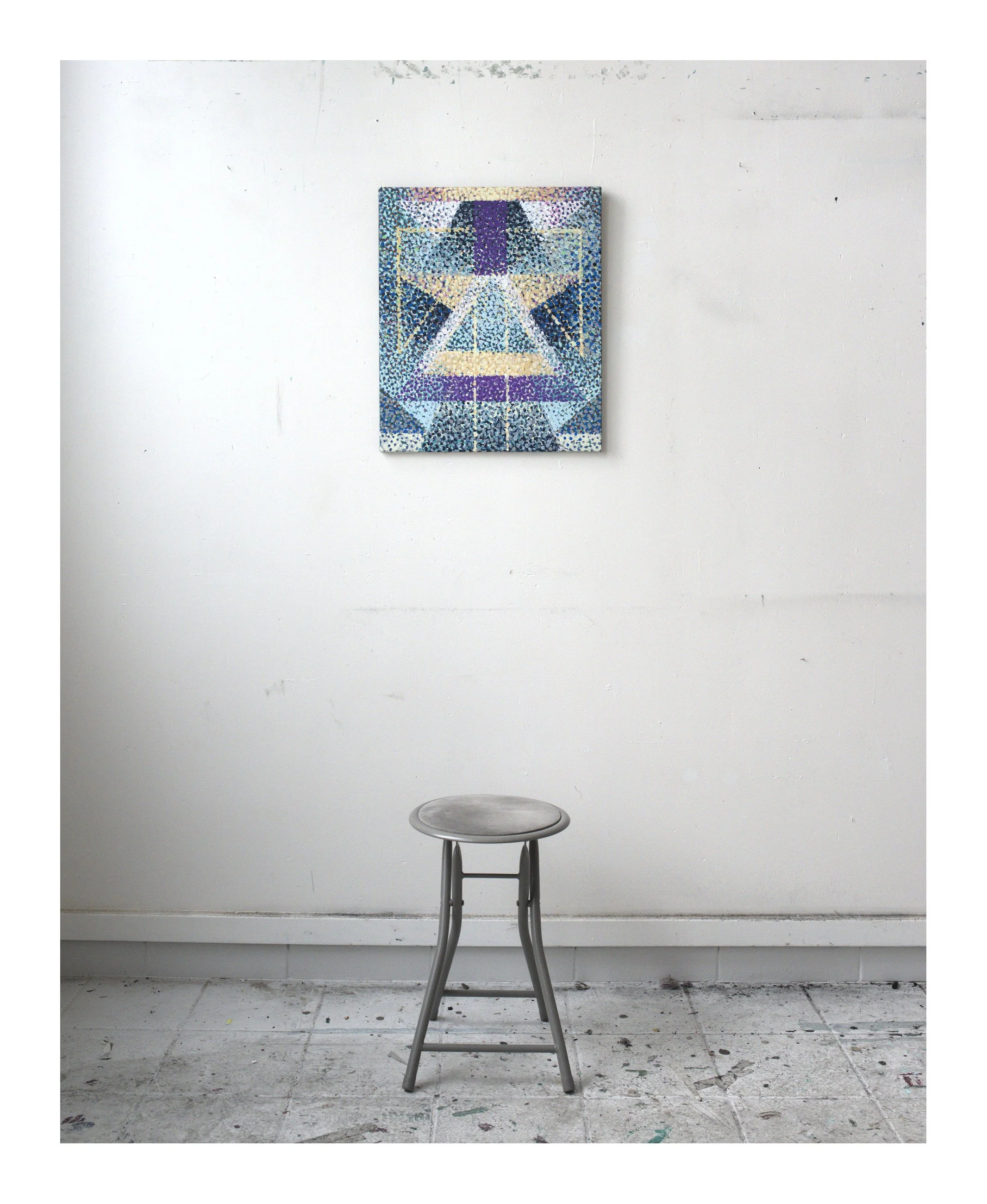
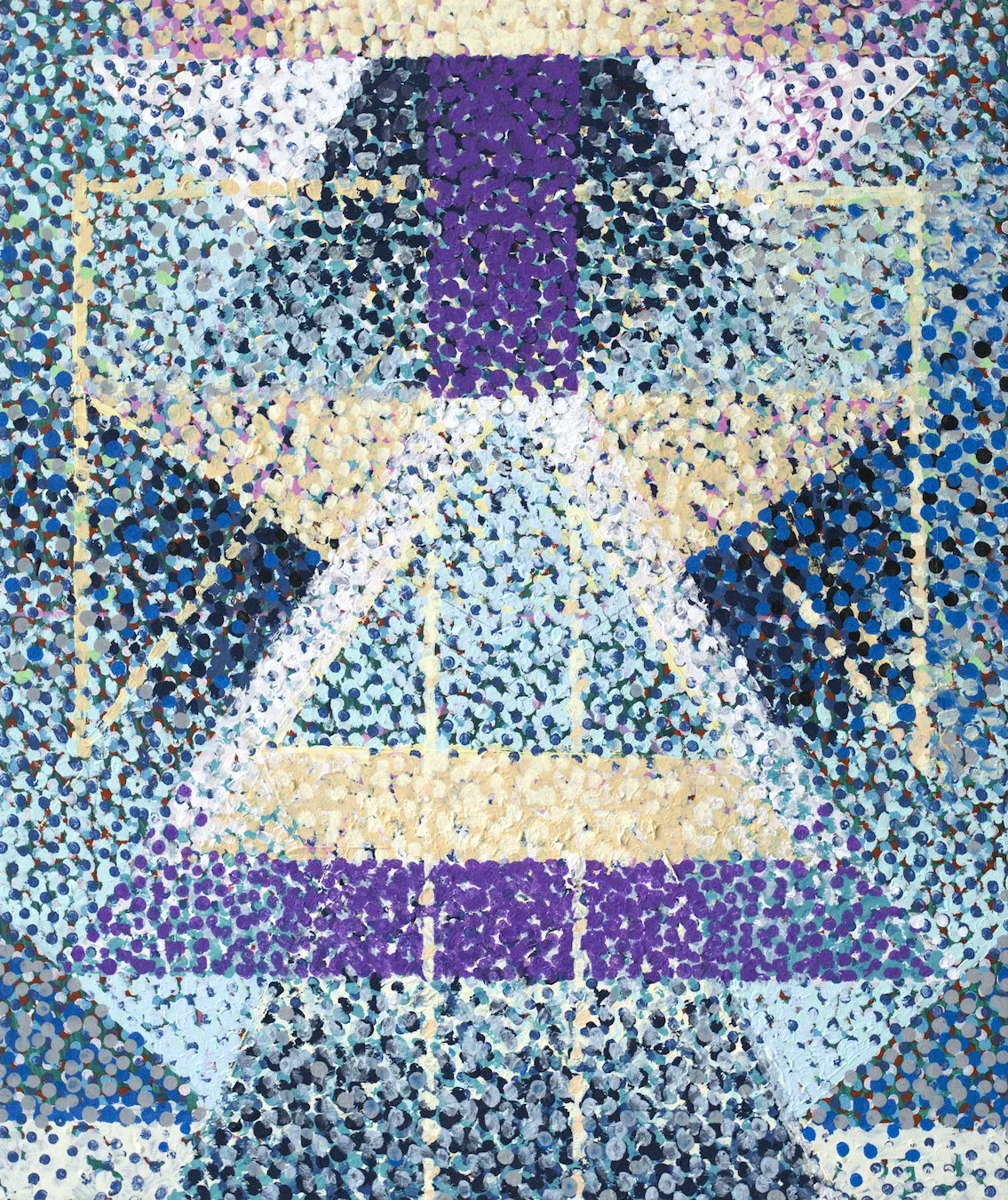
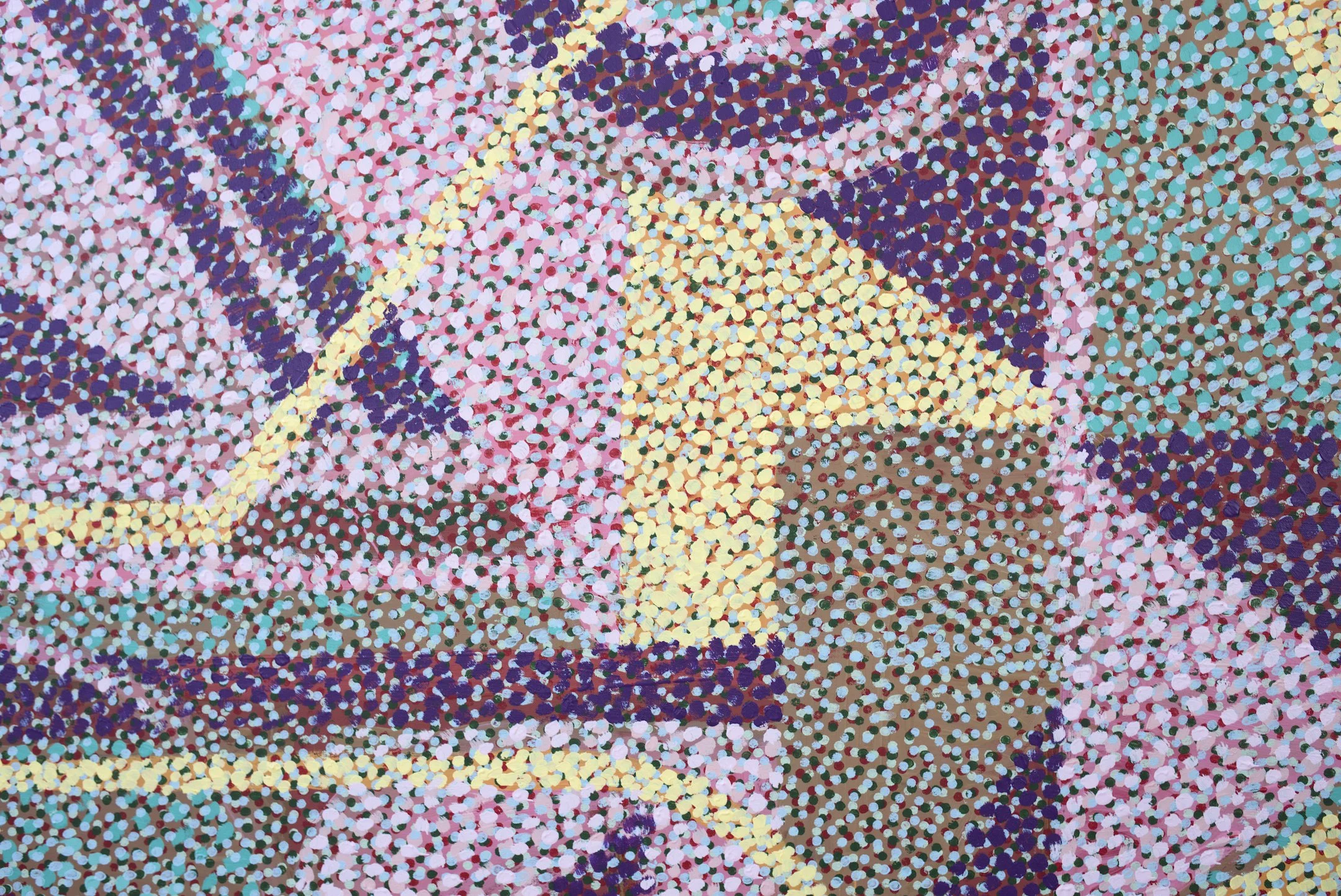
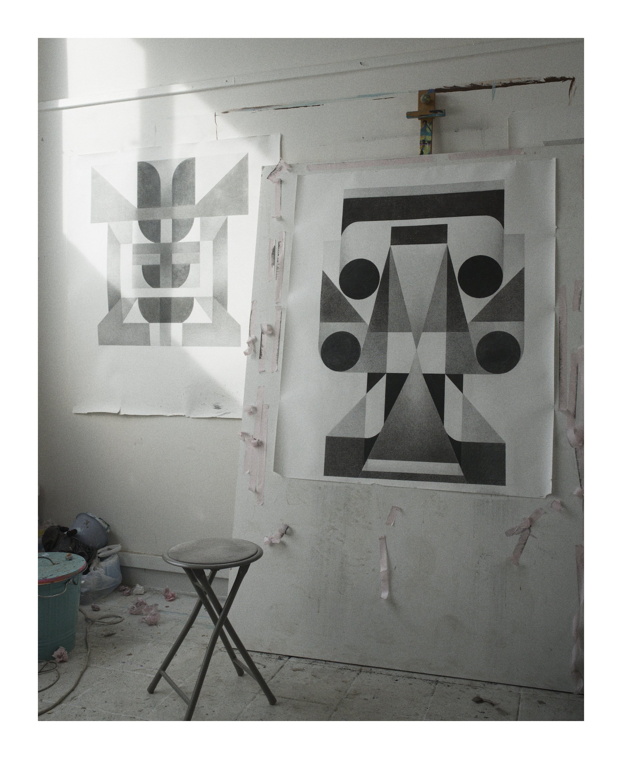
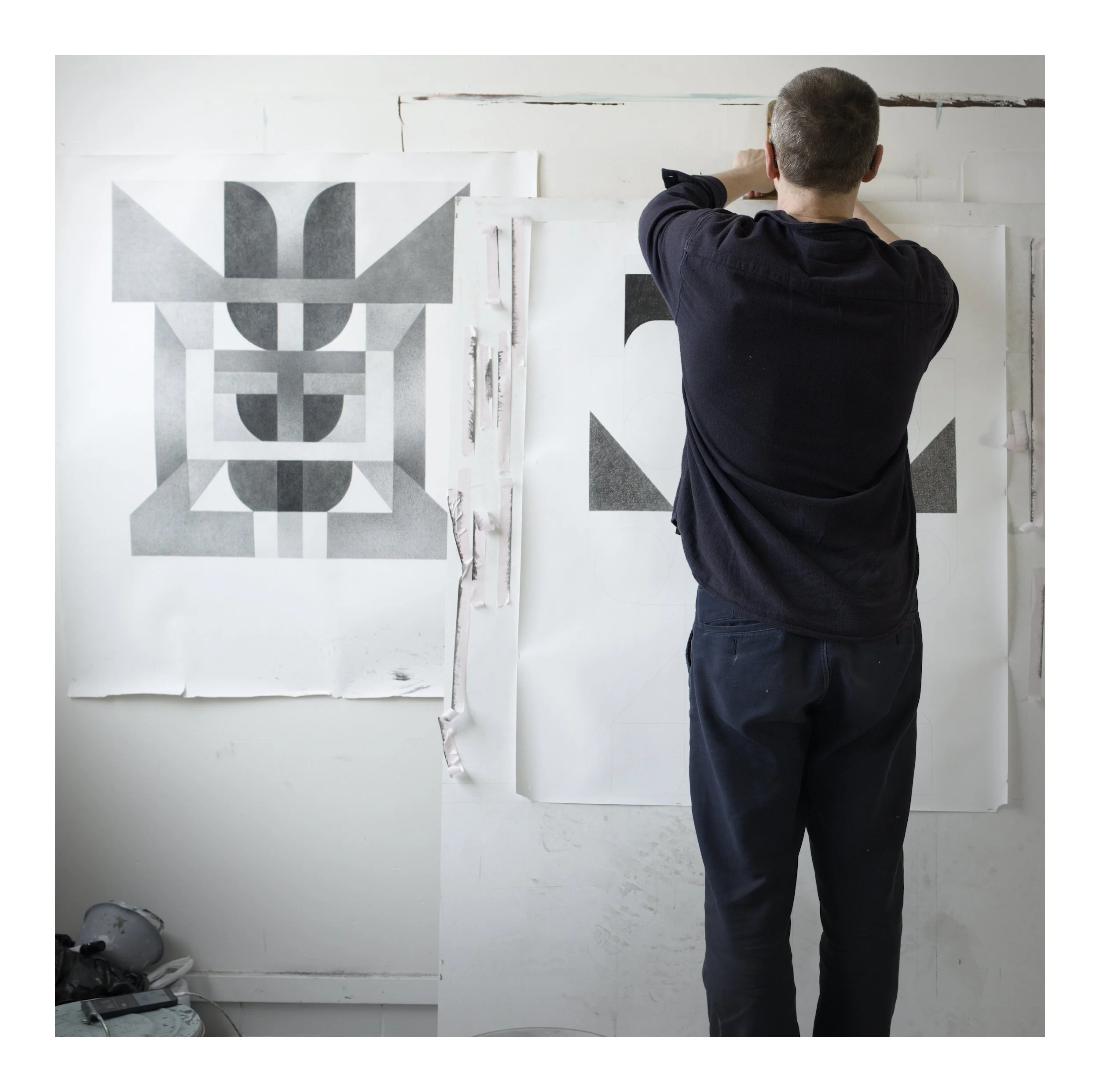
Sometimes I rotate the pieces as I work on them to counteract integrating gravity subconsciously. I find that it’s easier to keep them light and dancing that way. This one is a play with forms and shapes and pointillistic color.
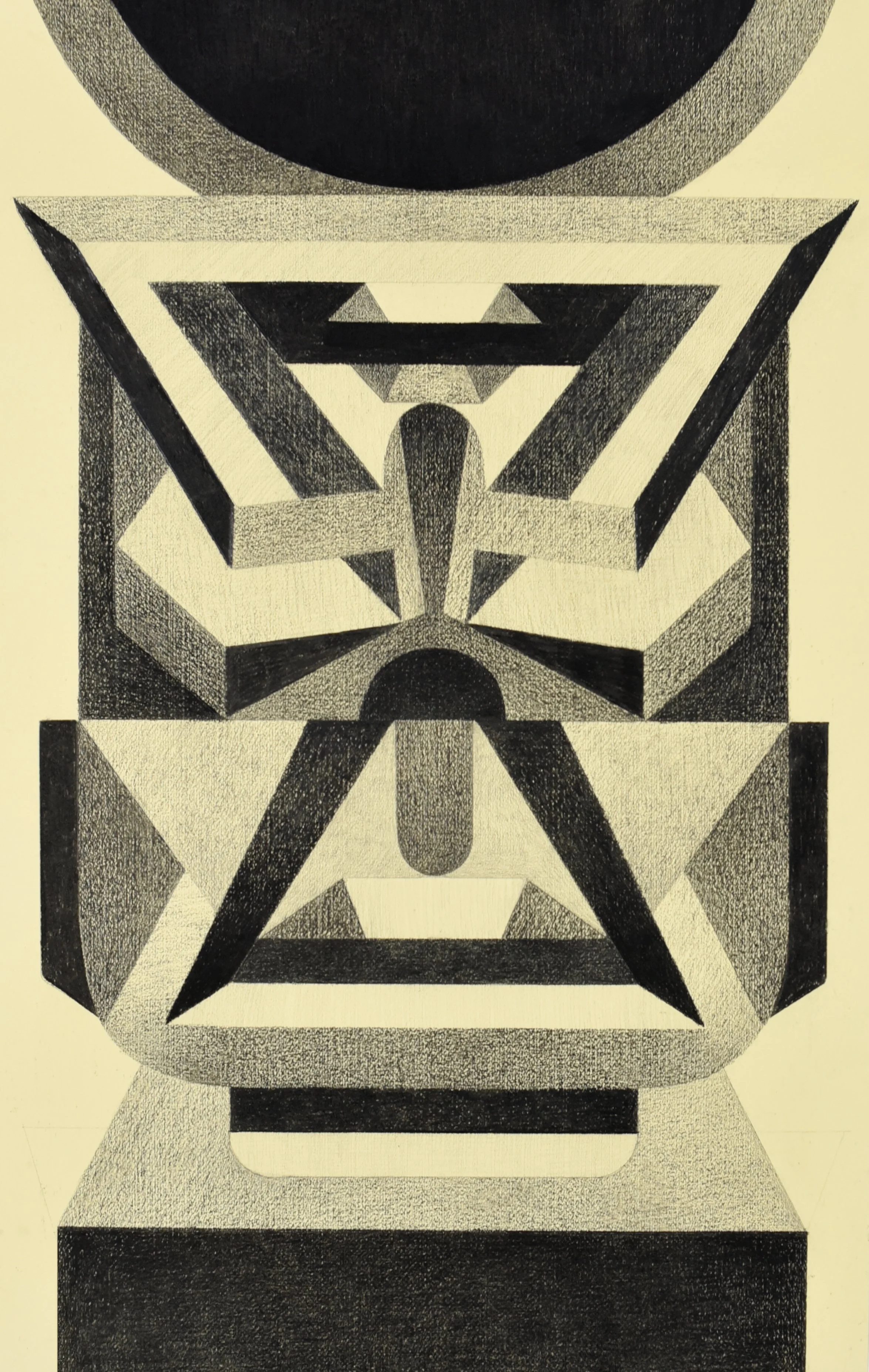
“The great structure”, 230 x 130cm. Acrylic on canvas. Adding some close ups below. To browse the full collection of pointillistic works, check out Light!
I started exploring dot painting about six years ago, and my technique has naturally evolved since then.
My first pieces were Dadaist-style collages where I used dots as patterns to separate color fields rather than to convey light. As my approach matured, I began covering entire paintings in orderly arrays to soften the sharp edges of those fields. I thought of it as a handmade, mutant version of rasterized 60s pop art prints: a strange mix of French Impressionism and Roy Lichtenstein.
Lately, my work has become even more impressionistic. I am treating everything as light, and those structured arrays are beginning to dissolve. My current goal is to translate the charcoal drawings I’ve been working on into large-scale impressionist pieces.
This shift even has me considering a return to oil paints. I’ve avoided them for the last five years because their slow drying time makes stacking orderly dots nearly impossible, especially compared to the thirty-minute window of acrylics. But now that I am moving away from rigid arrays in favor of a more fluid treatment of color, those technical constraints don't matter as much anymore.
Pictured:
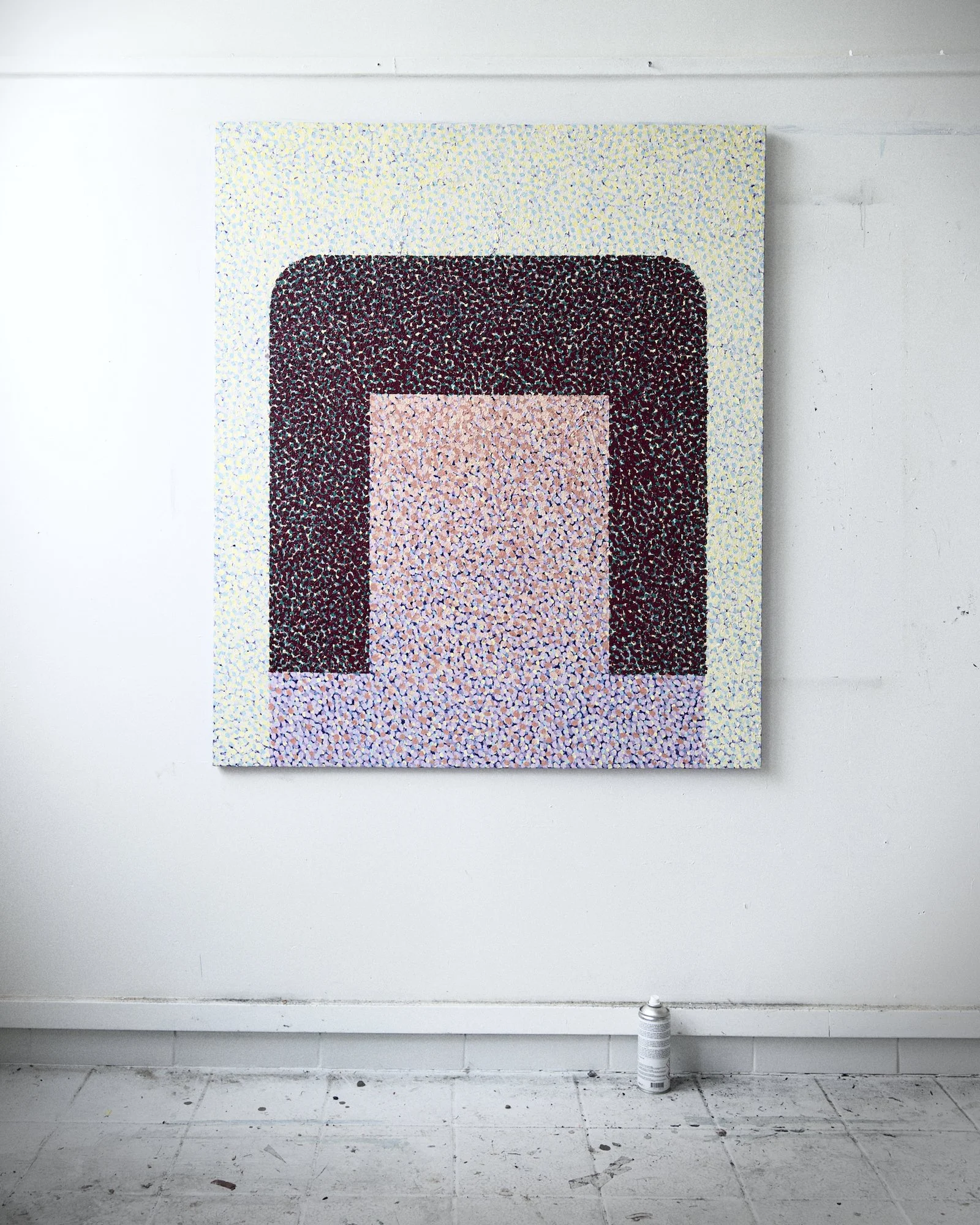
Vessel, acrylic on canvas, 120 x 100cm if I remember correctly but I’ll have to double check later when I’m back in the studio again.
To browse the full collection of pointillistic works, click here!
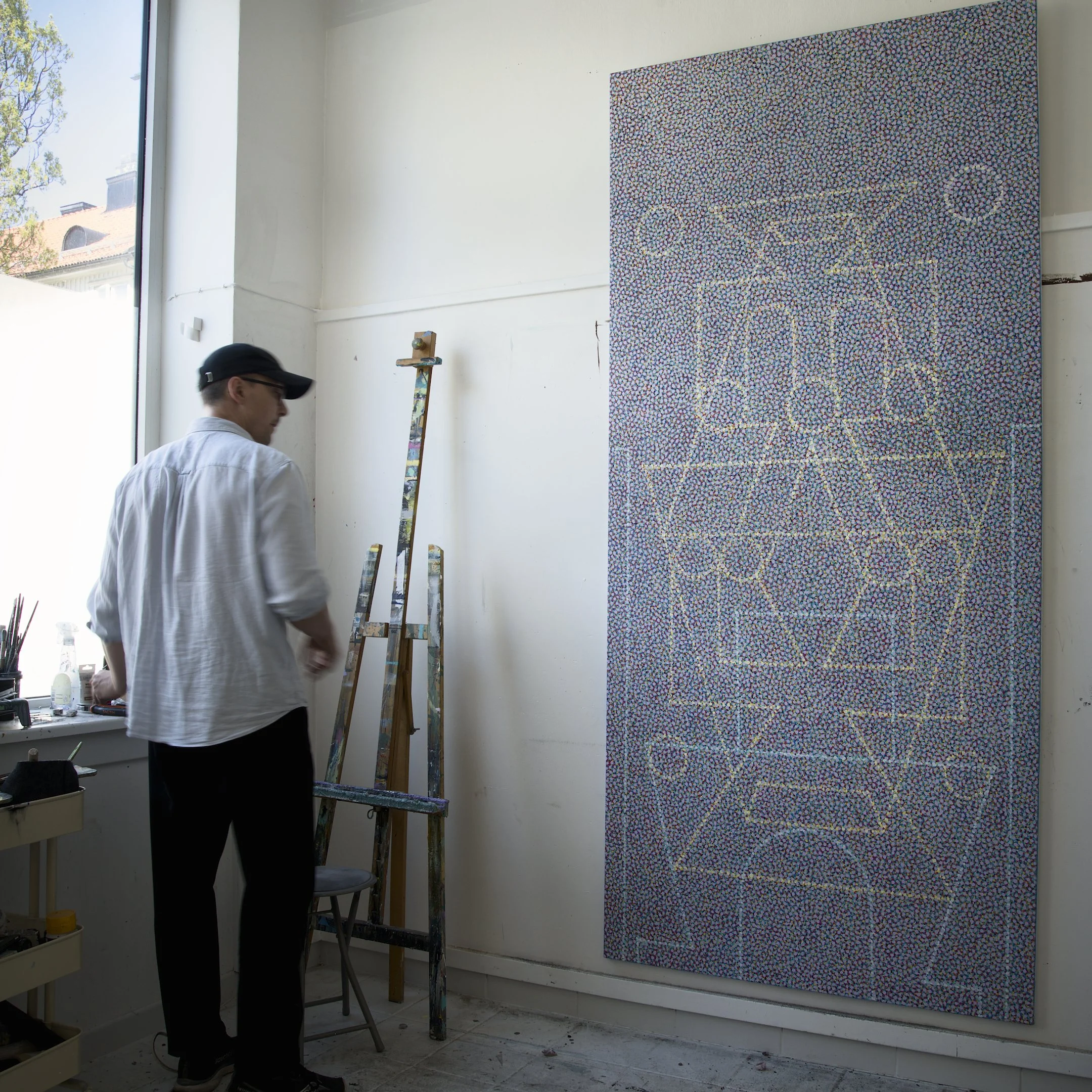
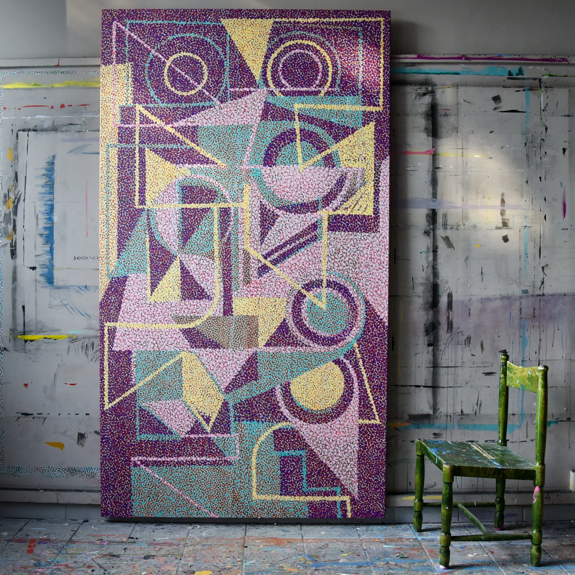
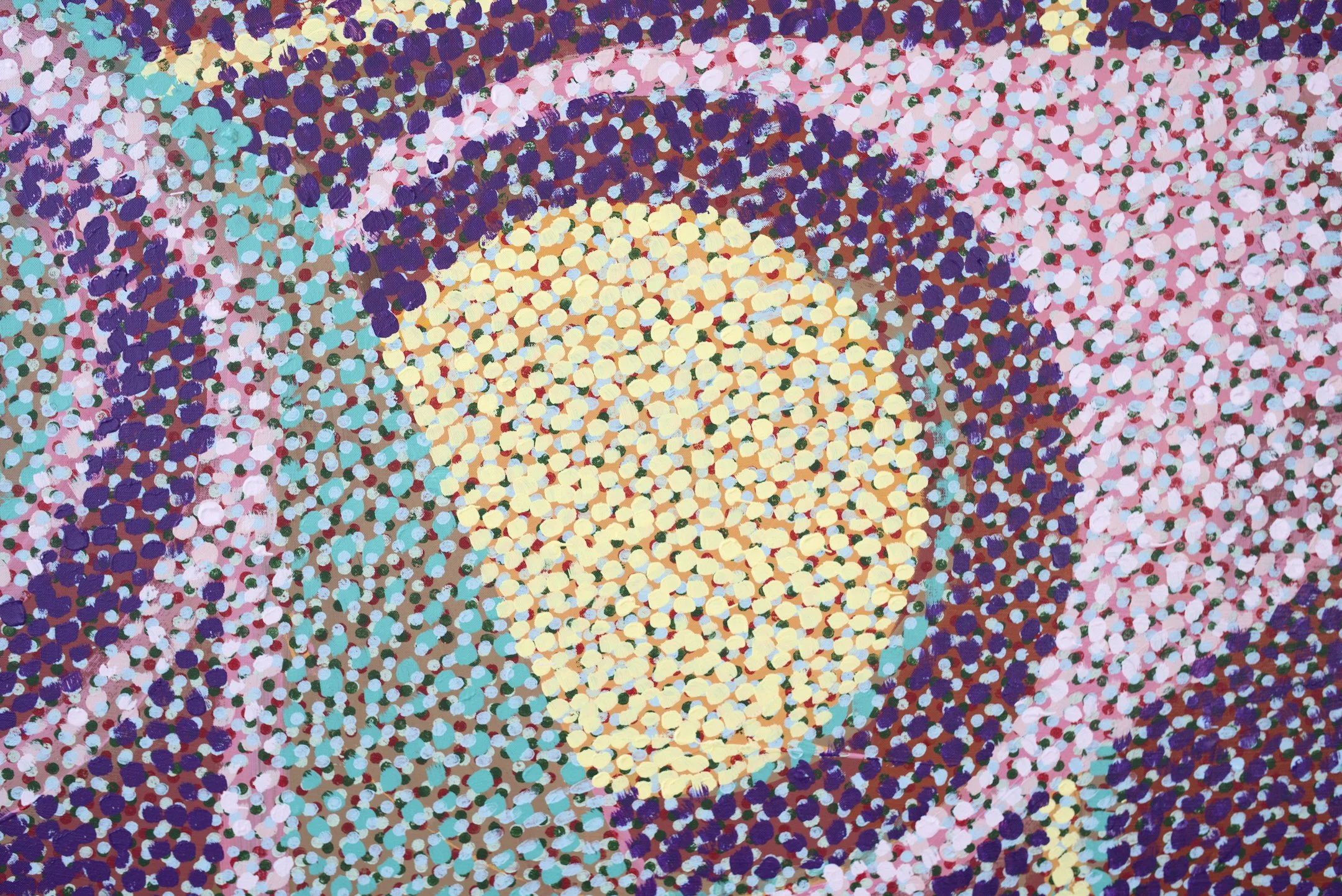
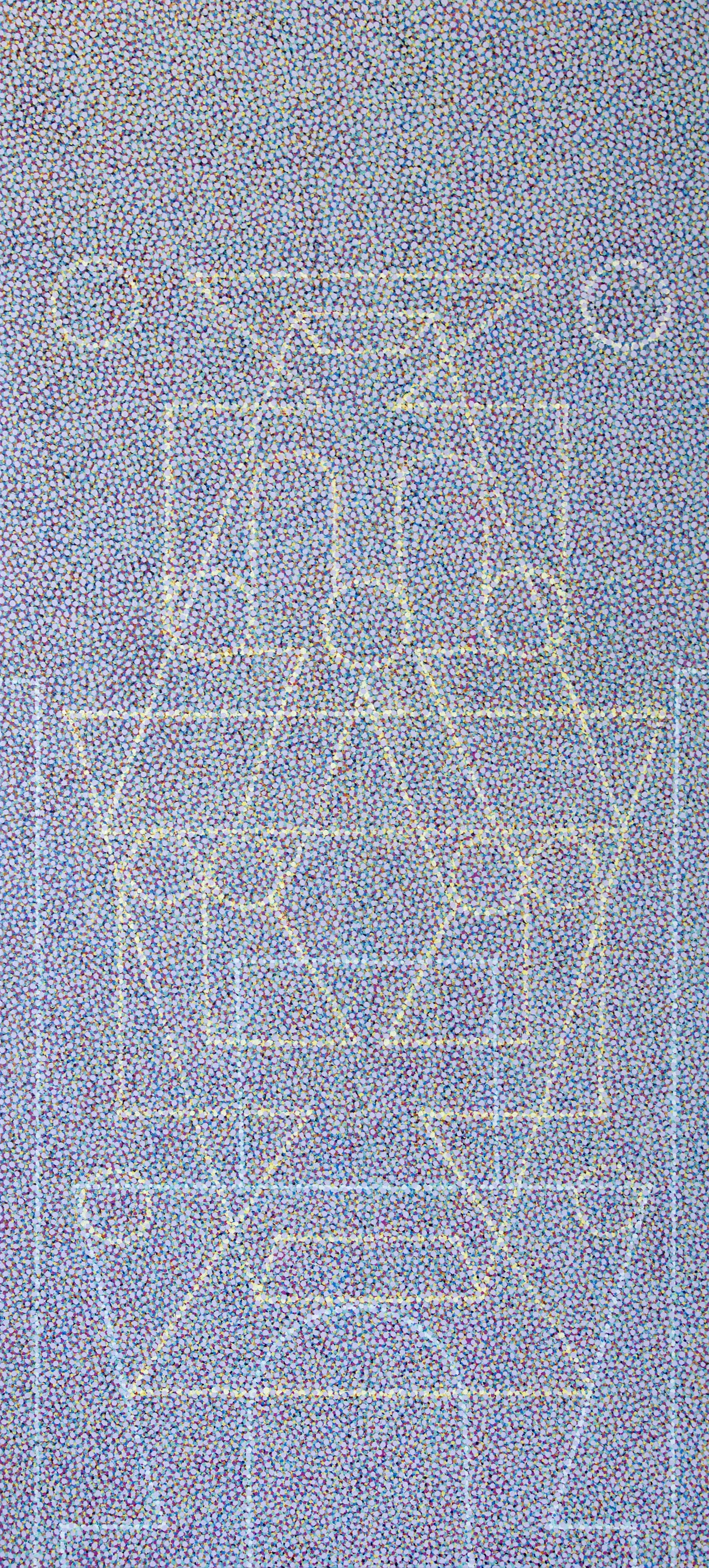
"Tower" is an absolute unit of a painting. At 250 by 130 cm, it is one of the largest pointillistic works to date and a massive presence that dominates the studio. This piece explores the tension between geometric structure and dissolution. A drawing emerges through a sea of innumerable dots, creating a surface that shifts between clarity and vibration. From a distance, the forms appear stable. Up close, they fragment into thousands of marks, dissolving into a field of color and rhythm.
To browse full collection of pointillistic works, check out: The Light
I'm working on a suite of charcoal drawings. there is something about this medium that always feels like home. Charcoal on paper, around 90 x 90cm. 2026.
Adding it to the drawings section.
Went down to the sea, made some gestures before the last light left.
Collage is about layering different pieces. Here, tonal layers overlap. The charcoal adds a grainy texture that makes the flat shapes feel physical.
Light and dark create the illusion of depth. The gradients suggest volume where there is none. It is a study of how shadow defines a surface.
More drawings in the gallery: www.miclinder.com/drawings
Charcoal on Fabriano 200gsm paper, somewhere around 120 x 100cm.
Sometimes I like the works the most like this: just plastered on the wall. Unfinished. Rough and raw. Some curled up pink tape to frame it all.
Had a pretty big win today, so I’m just gonna go get some ice cream and call it a weekend. Have a great weekend ya’ll!
Finished a new drawing as well, Komposition 1, adding it to the drawing section.
Komposition 1, charcoal on Fabriano 200gsm paper
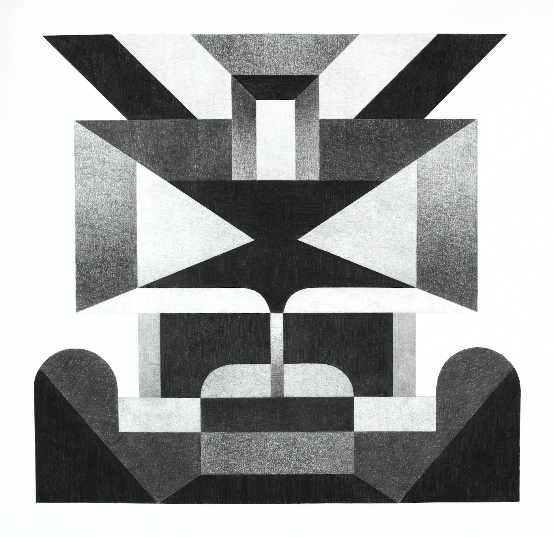
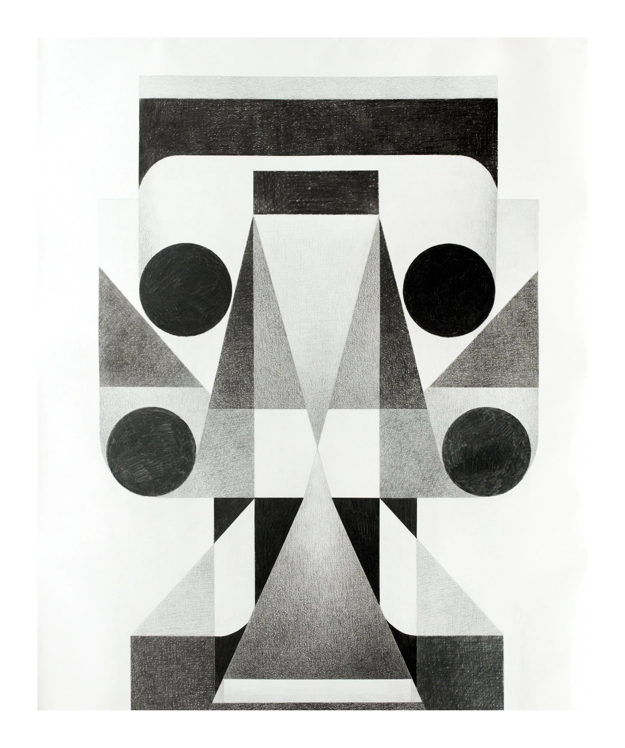
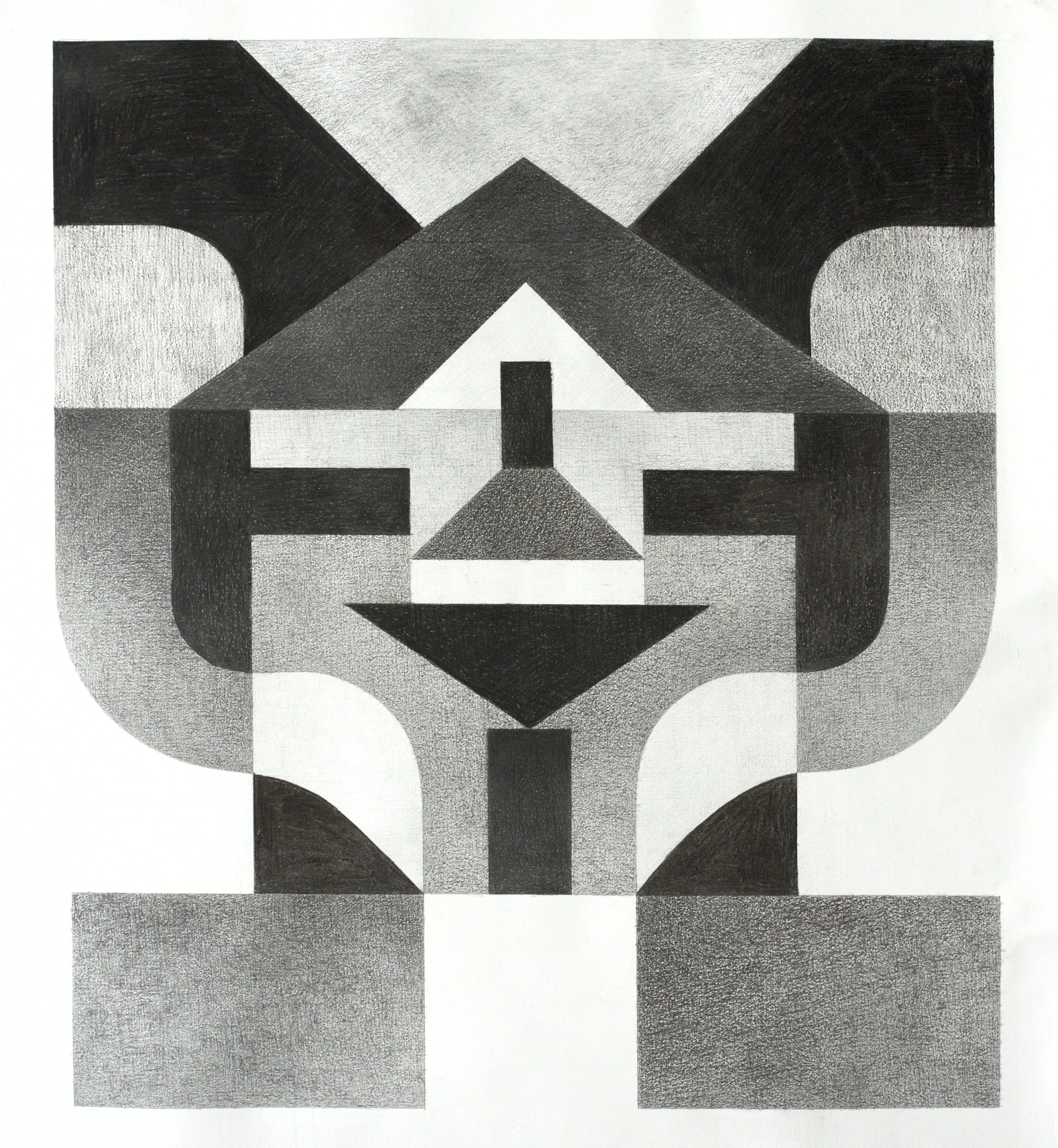
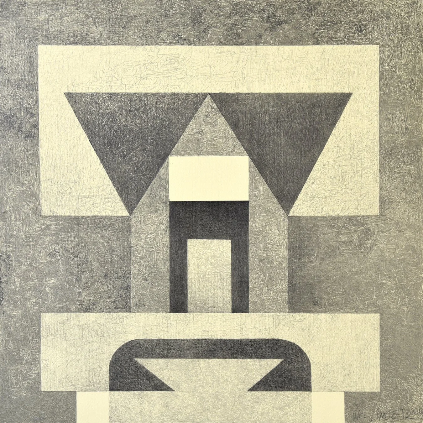
I’m deep into symmetry, structure and order right now. Doing miniature sketches that I intentionally keep very small to avoid unnecessary details. The fewer details, the better, I try to remove as much as I can without sacrificing the core. I look a lot at architecture and things that are raw and simple and durable. Like highway overpasses, pedestrian bridges, pyramids or water towers. I cut and paste it in my mind. When the line work is finished I then scale it up for the final work.
Moon monument
Charcoal on paper
Approximately 100 x 100cm.
2026
For more similar works, check out the DRAWINGS vault!
home is where the art is.
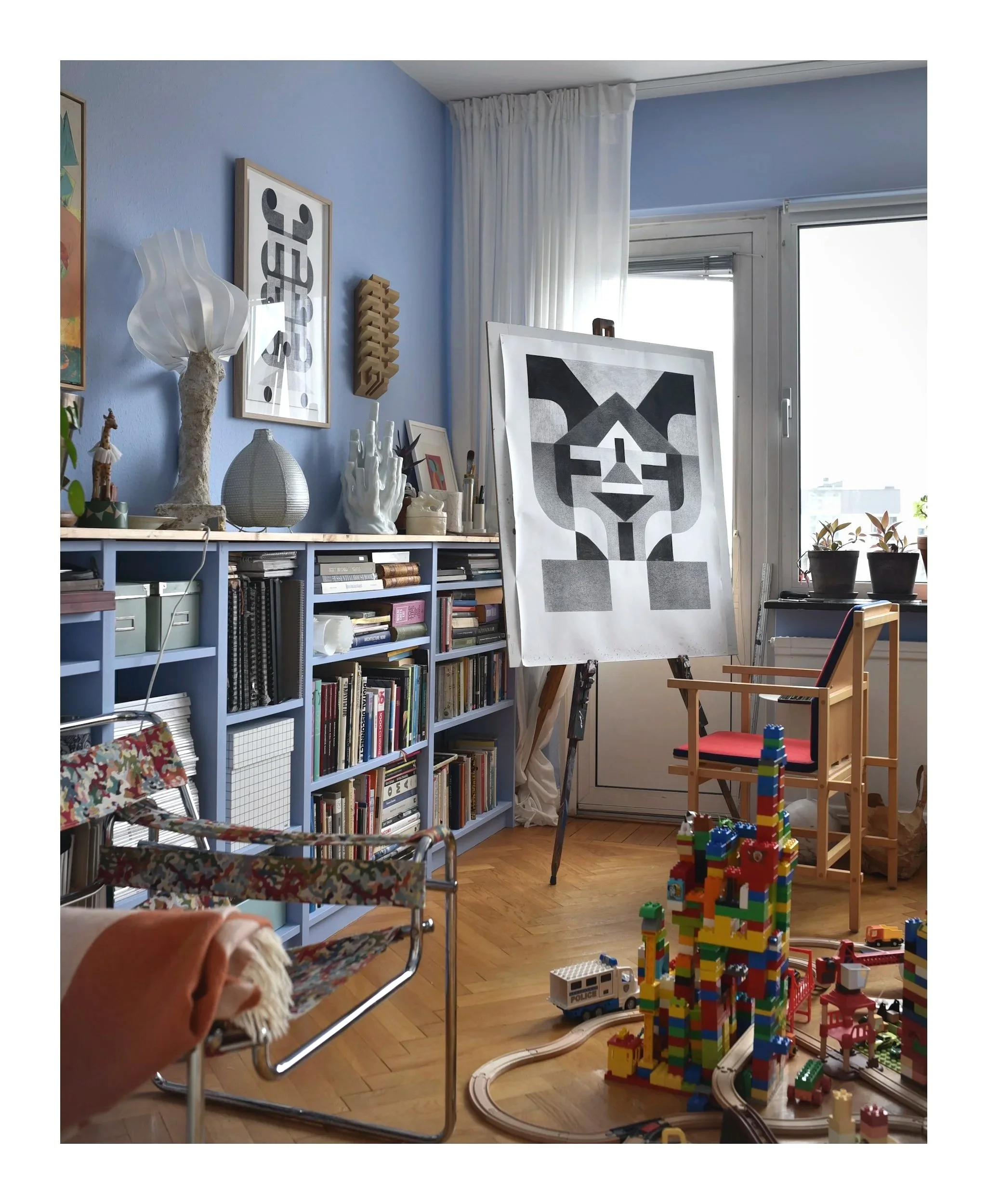
Brought some drawings-in-process home during the snow storm so the home office is currently extra busy, especially considering the complex infrastructure projects permeating the floors of the place. But it’s all good, luckily there are no minimalists in this household.
The chair to the right is the best thrift store find I’ve ever made by the way - signed underneath “Stol nr. 3, Stefan Bofeldt”. I have no idea who it is or when it’s from but I love the design. Weird bauhausian thing, geometric and inviting.
Another abstract, rhythmical, architectural and geometric drawing on paper.
It’s a mixture of charcoal and pencil on paper. Measures around 90 x 90 cm.
Adding it to the drawing collection as well, check it out if you want to see similar works!
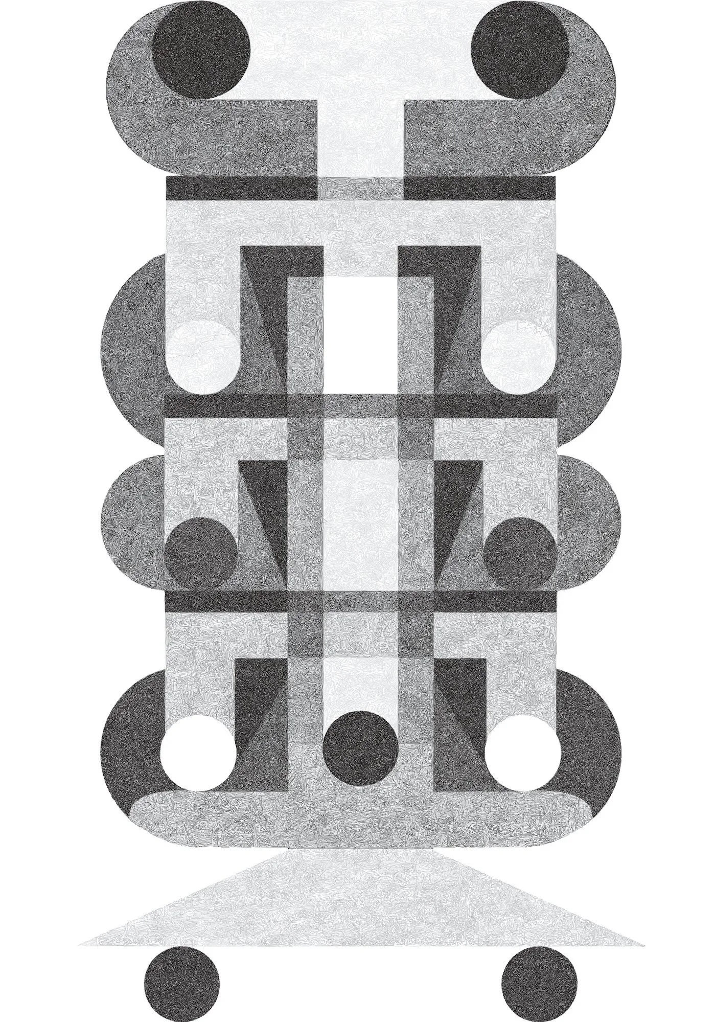
I’m experimenting with a pen plotter in conjunction with an automatic pen in order to make these strict, geometric and minimalist abstract drawings. The process looks something like this:
Make a very small sketch, I make my sketches in an A6-sized sketchbook. Small enough that it is impossible to overload the composition with unnecessary details: must be as few forms as possible.
I digitalize, colorize, and vectorize the sketch, refining those few forms into a clean digital blueprint.
The vector data is then converted into precise instructions for the plotter.
Finally, the piece is brought back into the physical world. I always work alongside the plotter, so there is a constant manual element: adjusting the pen, the pressure, or the flow as well as cross hatching parts myself.
This one is called “Pylon”.
Pencil on colored paper, 50 × 50 cm
Abstract, constructivist, concrete drawing.
Made in 2026
For more works like this, check out the DRAWINGS section.
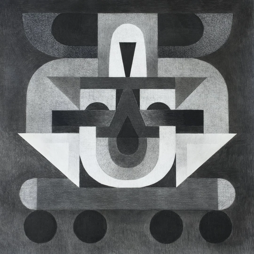
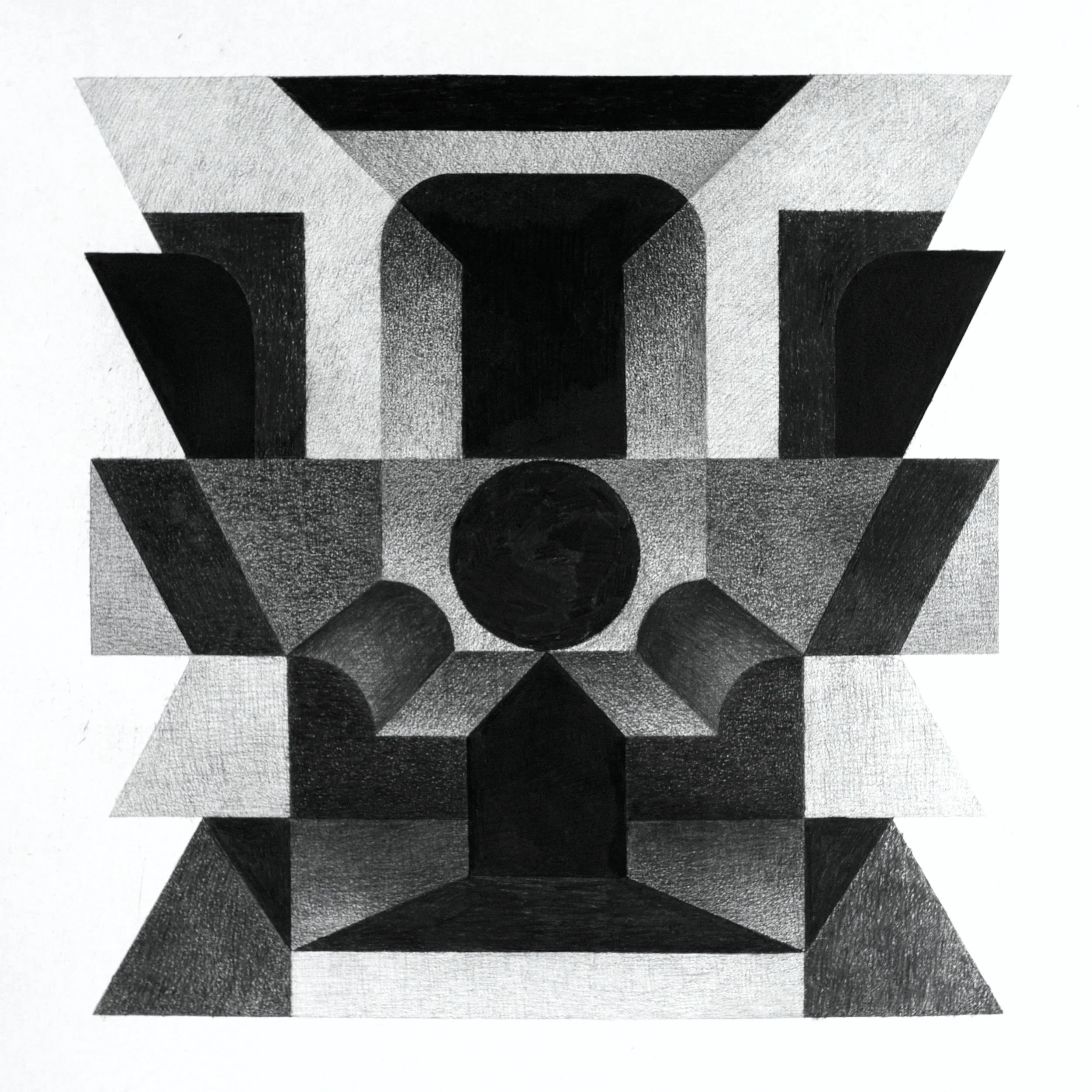
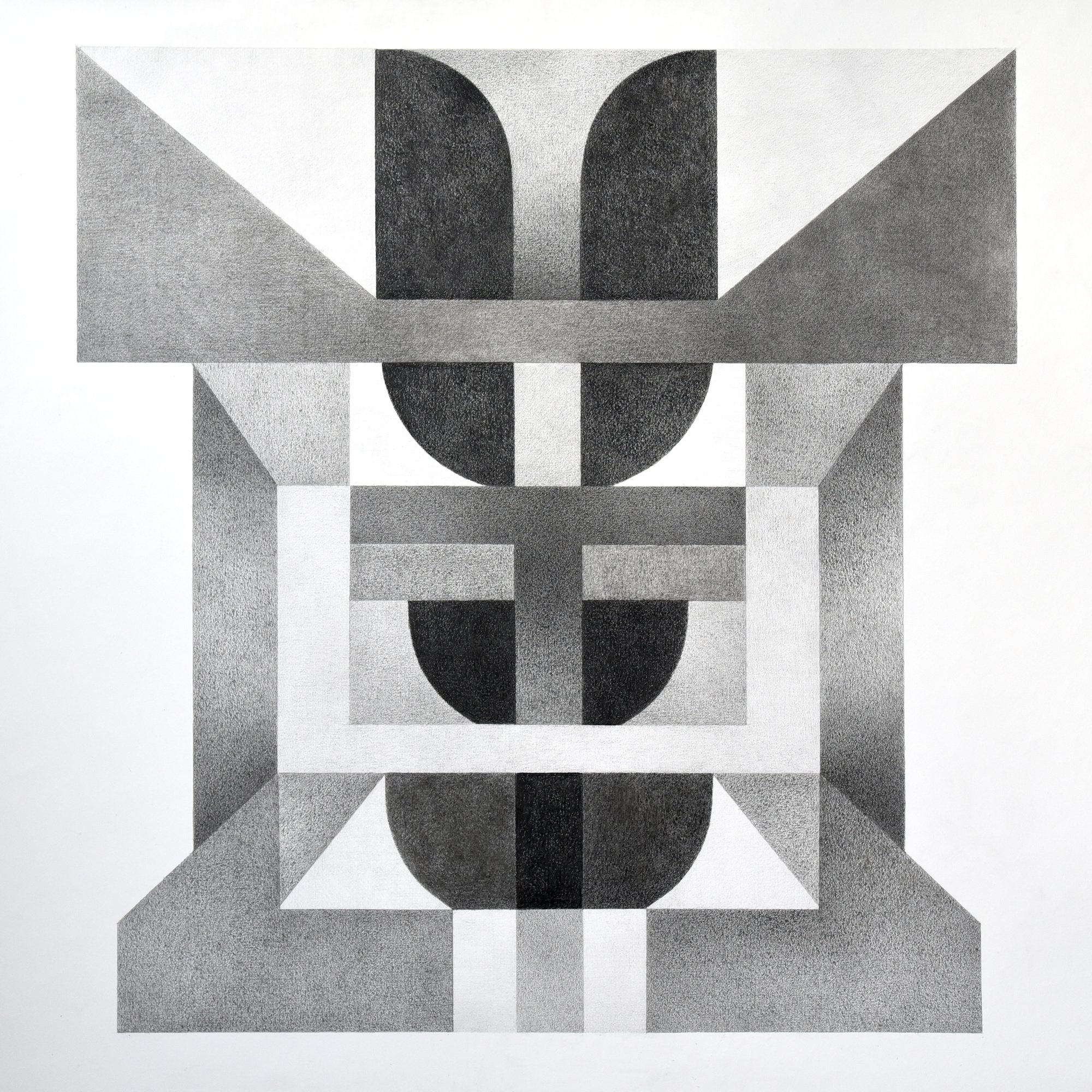
Happy to announce my new print drop! After several rounds of test printing and an unreasonable amount of paper inspecting, here it is: Totemic.
It’s a geometric and monochromatic study in rhythm and symmetry. By stacking interlocking spheres and angular pillars, the piece creates a totemic structure that feels both architectural and mechanical. The fine, stippled texture adds a tactile depth, transforming simple geometric forms into a complex play of light, shadow, and overlapping layers.
42.5 × 60 cm, archival quality digital print on structured and heavy Hahnemuehle German Etching 310g paper.
Available via the shop!
This is a minimalist, hard-edge charcoal drawing based on my collage process. I start with tiny sketches to focus on the big picture without getting bogged down in minor details. Once the composition is locked in, I scale the work up to its final size.
charcoal drawing, circa 100 x 70cm
For more of my drawings, check out www.miclinder.com/drawings!
I’ve titled it Johanneberg after my neighborhood, as a small nod to the Bauhaus-inspired functionalist architecture in the area. The piece is part of an open edition and is sort of a play with perspective, space and geometry.
Available through the webshop: miclinder.com/available-works
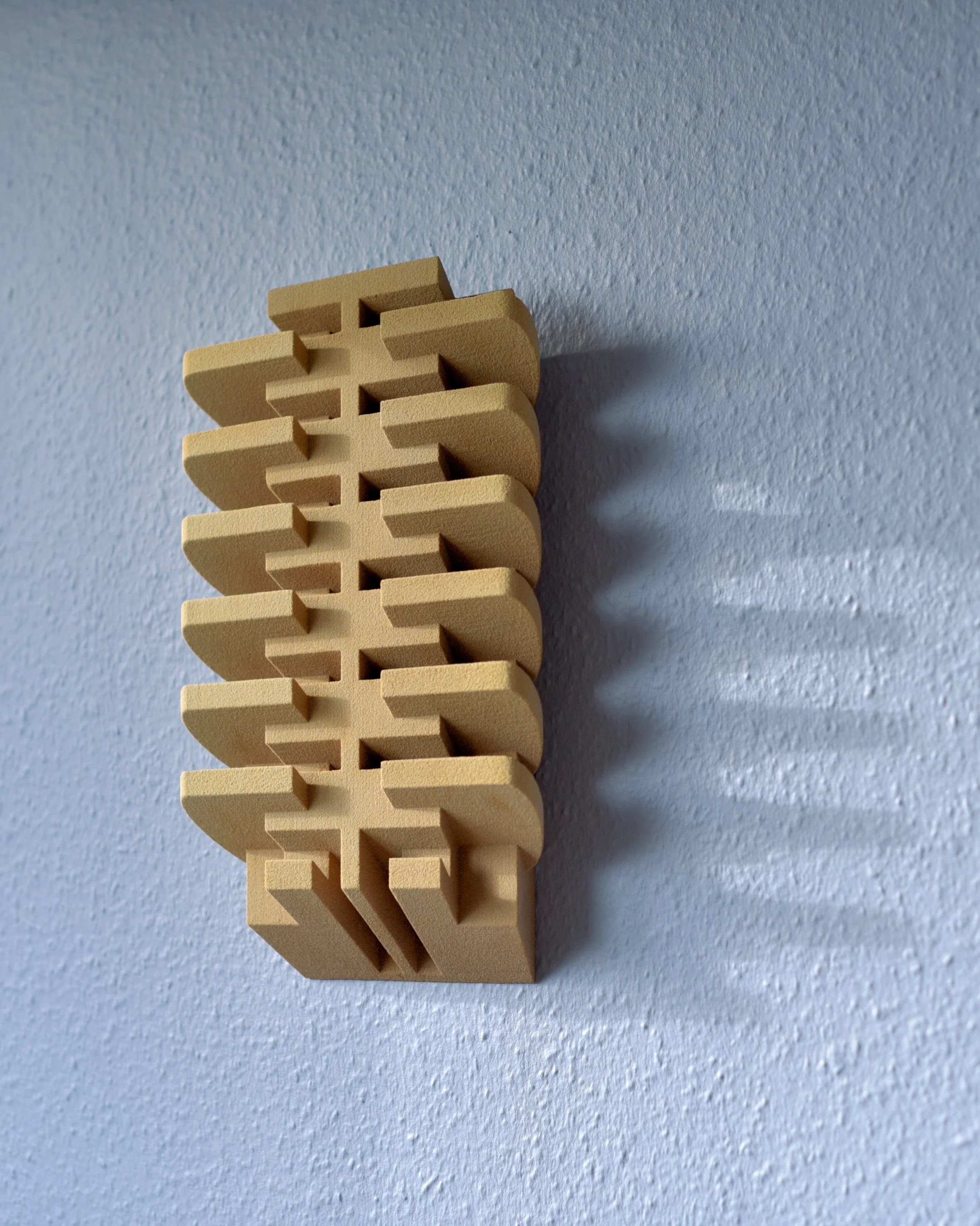
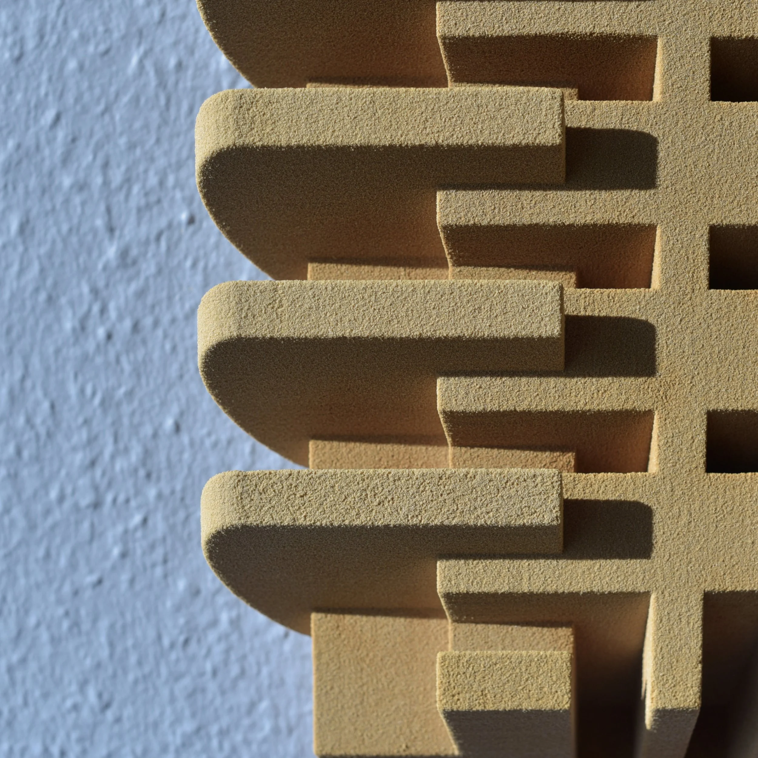
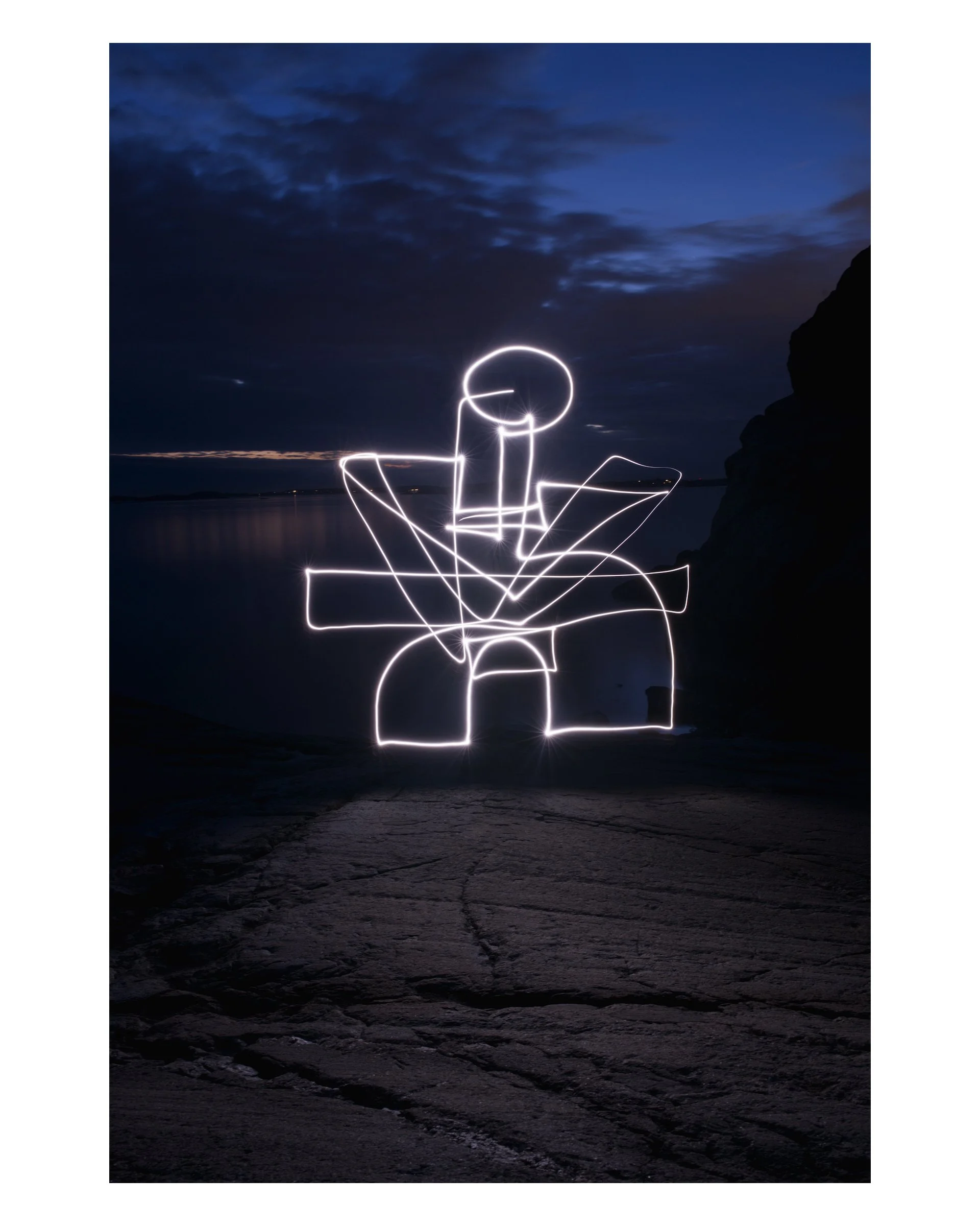
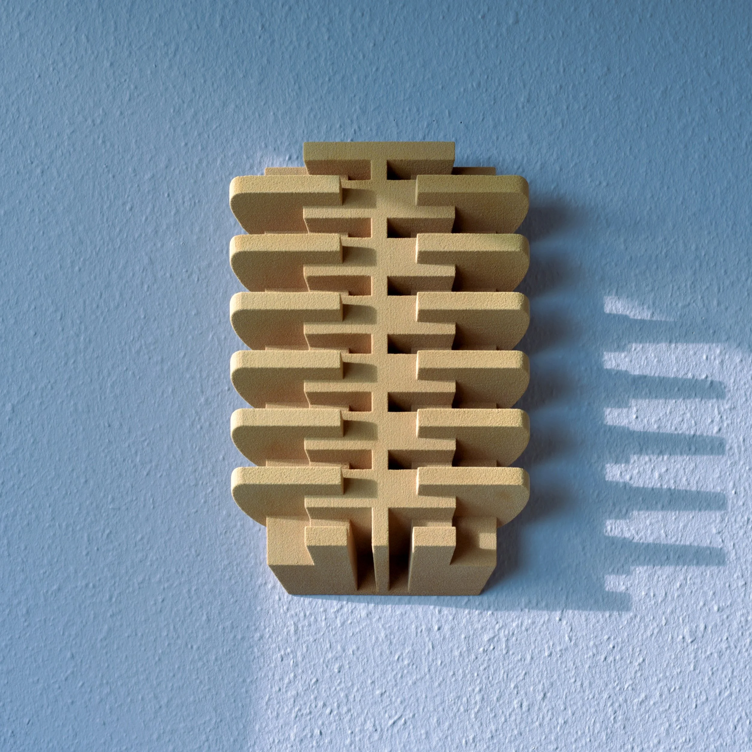
Super excited to share my latest sculpture!
Created in collaboration with Sandhelden in Germany, it’s made using their unique sand 3D-printing process, which allowed me to transform my digital design into a real, tactile object.
I’ve titled it Johanneberg after my neighborhood, as a small nod to the Bauhaus-inspired functionalist architecture in the area. The piece is part of an open edition and is sort of a play with perspective, space and geometry.
It’s now available in the Available Works section of the site.
And just a note: in the animation, I played a bit freely with color! For the sculpture’s true tones, check out the photographs through the link.

I think it’s interesting how strict geometry can still feel soft and human through these layered, textured lines. The mechanical pencil’s recurring mechanical failures give the process a life and randomness that’s pretty funny concidering how structured the process otherwise would be, I was concerned that bringing a plotter into the mix would make the drawings too rigid and ordered but the effect was the opposite: the plotter is way less ordered than I am and these drawings that are part human and part machine are less ordered than my purely manual drawings. My machine is humaning better than me at the moment strangely enough, I can’t but laugh.
Added to DRAWINGS and AVAILABLE WORKS!
Symmetri" is one of my first plotter/manual drawings, created with a 2D pen plotter I recently brought into the studio as a kind of assistant.
For this piece, I worked with an automatic pencil, adjusting both tension and lead softness to achieve depth and darker tones. It’s an early experiment in trying to combine mechanical precision with the sensitivity of hand-drawn graphite.